The Nueva Pescanova Group applies for a plan to save Mira, the turbot farm in Portugal
31 January, 2017
The General Meeting of Partners of de Nueva Pescanova approves the capital increase of the Company
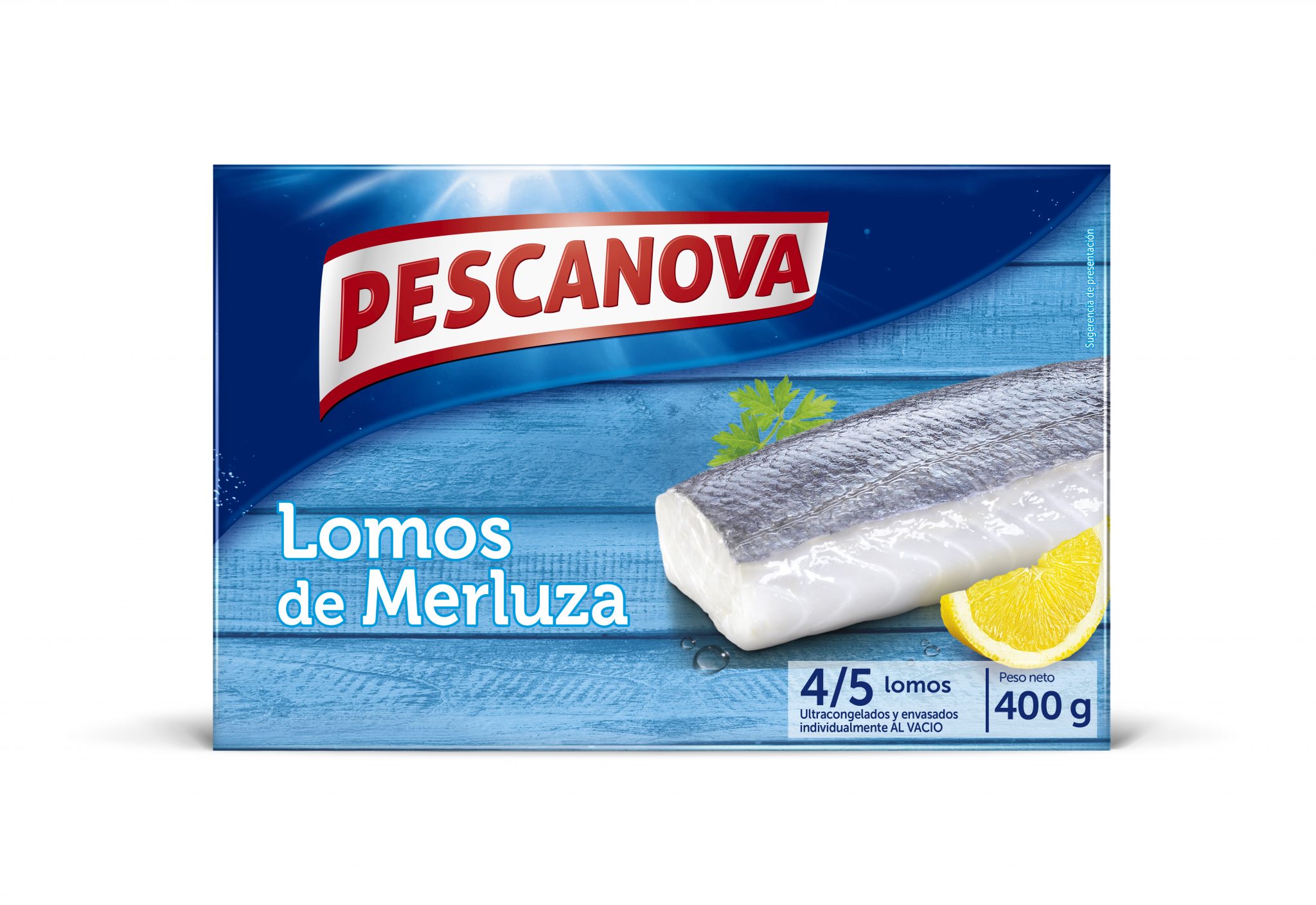
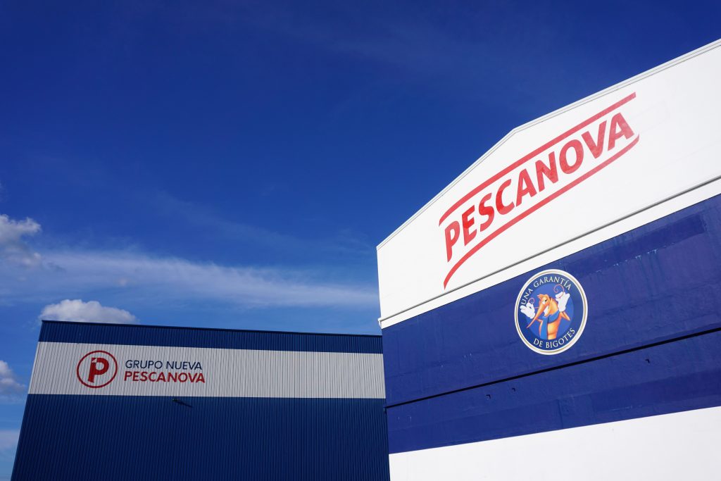
19 April, 2017Vigo, 9 February 2017.- Pescanova has unveiled today its new visual identity, a makeover of both the corporate and the commercial image of the Nueva Pescanova Group. For the brand’s image, the Company has opted to redesign its current logo, maintaining the red colour and the capital letters, by doing so the brand evolves but at the same time preserves its essence and takes advantage of the good perception of the brand in consumers’ memory.
In this way, we have enhanced its personality, conveying emotion, movement, freshness and modernity, to connect with our most loyal buyers and at the same time be more inviting, fresher and more appealing to younger generations.
The new logo is inspired in the marine environments and the movement of flags flying. Accordingly, the new DNA of the company – which seeks to bring the freshness of the sea to consumers’ tables with the same quality as we have been doing over 57 years – is caught at a glance.
“Pescanova is a loved brand for consumers. It has come the time to change, to take a step forward into the future, to renew and adapt to new market trends and convey a more dynamic appearance, without losing our essence. With this new image we want to keep in mind that from day one we are innovative and we have great respect for what the sea provides us. There is no doubt that this change is not only a facelift but it also shows our desire, passion and strength,” has said Ignacio González, CEO of the Nueva Pescanova Group.
In short, with this redesign, the first in its history, the company seeks its identity to reflect the new strategy of the Group which focuses, among other aspects, on a firm commitment to sell under the Pescanova brand name and on innovation to deal with the launching of new products and formats concentrated on new consumption trends. The brand will use the claim “no perdamos la frescura” (let’s stay fresh) in different media, such as social networks.
In the coming months, the new logo will be placed progressively, and globally, on the new packaging of all its products. At present Pescanova sells its products in 80 countries in five continents.
The image of the Nueva Pescanova Group
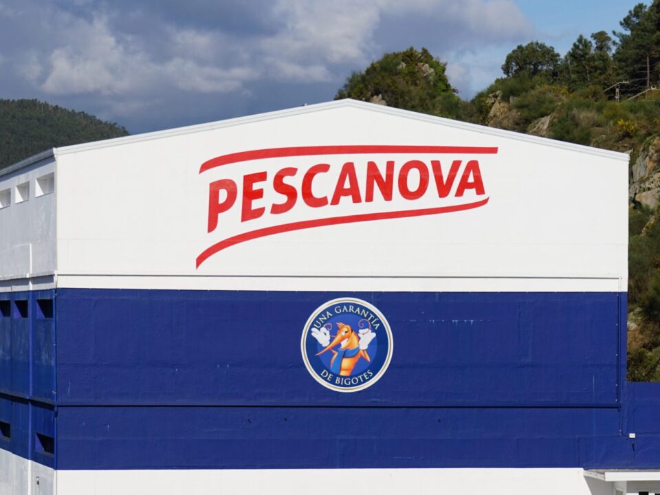
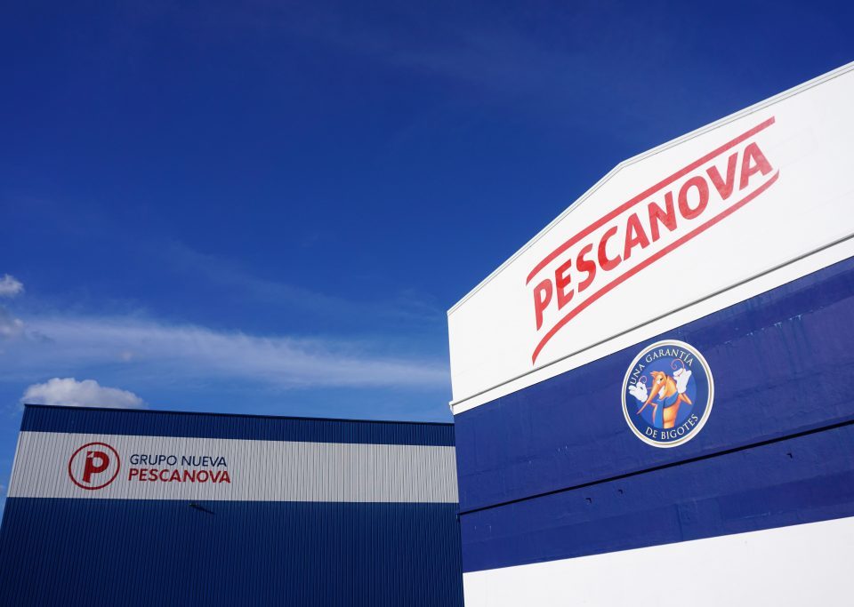
The Nueva Pescanova Group revealed today a renewed corporate image, to accommodate it to its new reality: it is a new company since 2015 but has not forgotten its past. Therefore, the company is committed to keep in mind its hallmark, which is recognized worldwide, and to further update and modernize it. In this way, the initial “P”, that has become bigger and more geometric, has gained volume by simulating the folding of its upper-left corner, to give the idea of a fish, and to bring to mind the essence of the Company: a Galician multinational Company, leader in the seafood sector; engaged in fishing, farming, processing and trade of seafood products, and at the same time strengthening its icon.
As for the typography, the Company has opted for the sobriety of geometric lines, which gives it a strong, fresh, modern and inviting character. Using a brighter blue colour for the words “Group” and “Nueva” to present a more elegant, younger and contemporary look. On the other hand, emphasis is put on the word “pescanova”, maintaining the red colour but with a different tone, while the two “a” letters have been customised with an ad hoc typography, suggesting movement and granting a unique visual identity for the Company.
The image of the Group will gradually be present in all its subsidiaries, as part of the Company’s commitment to a visual standardization of all the companies that make up the Group regardless their names, visually sheltering under the same umbrella the entire Group.
